This page will provide a detailed break down of the various elements of GFR Reports.
Each section will show the highlighted area on the full report along with a description.
Chart Location
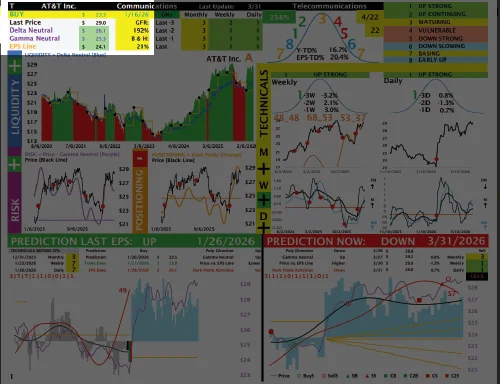
In this section, you will find:
- Company Ticker.
- Company Name.
- Company Sector.
- Current Rating: Buy or Sell.
- Price of last Buy or Sell.
- Date of last Buy or Sell.
- Last Price.
- Delta Neutral Level.
- Gamma Neutral Level.
- EPS Line Level.
- GFR Performance last 5 Years.
- Buy & Hold Performance last 5 Years.
Chart Location
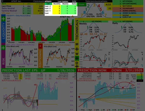
In this section, you will find:
- Date of last update.
- Monthly Technical Ratings for the last 4 months.
- Weekly Technical Ratings for the last 4 weeks.
- Daily Technical Ratings for the last 4 days.
Chart Location
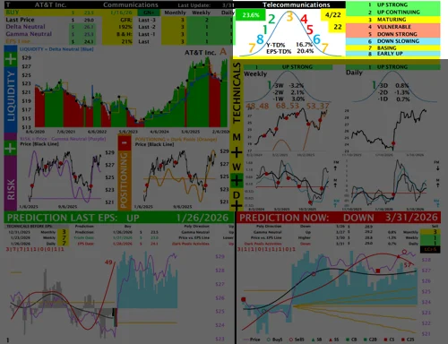
In this section, you will find:
- Industry
- The current open signal P/L is shown in the box at the top left. The box appears green when the open P/L is positive and red when the open P/L is negative.
- The date of the next earnings release appears in the yellow box at the top right.
- The number of days remaining until the next earnings release appears in the bottom yellow box.
- Inside the price acceleration curve, you will find the year-to-date performance and the performance since the last earnings release.
- Technical model curve ratings are displayed within the acceleration curve and include the meaning of each numerical rating.
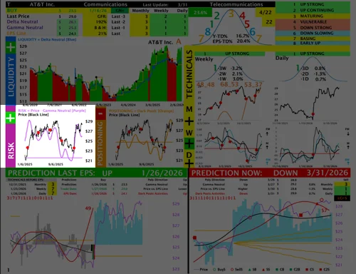
Chart Location
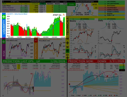
In this section, you will find:
- Liquidity Analysis.
- Name of the Company.
- The black dots on the chart mark the days when the company announced earnings.
- The yellow line represents the earnings line.
- The blue line represents the Delta Neutral level, which the model uses to evaluate LIQUIDITY. When the blue line is trending higher, the model interprets that as a positive liquidity environment. When the blue line is trending lower, the model interprets that as a negative liquidity environment.
- The chart is shaded green when the model has a BUY rating and red when the model has a SELL rating.
- The letter next to the company name indicates whether the stock is trading above or below the earnings line. An A means the stock is trading above the earnings line, while a B means it is trading below it.
Chart Location
In this section, you will find:
- Risk Analysis.
- The purple smooth line represents the Gamma Neutral level, which the model uses to evaluate RISK. When the purple line is trending higher, the model interprets that as a RISK-ON environment. When the purple line is trending lower, the model interprets that as a RISK-OFF environment.
- The flat purple line separates positive risk from negative risk. Risk is positive when the purple line is above it and negative when it is below it.
- The red dots on the chart mark the days when the company announced earnings.
- The black line represents the daily stock price.
Chart Location
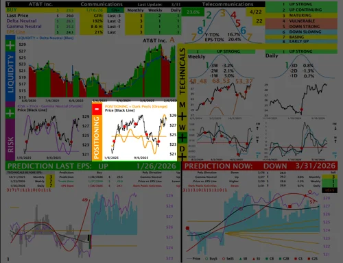
In this section, you will find:
In this section, you will find:
- Positioning (Dark Pools) Analysis.
- The smooth orange line represents Dark Pool activity, which the model uses to evaluate positioning. When the orange line is trending higher, it indicates that Dark Pools are accumulating the stock, and the model interprets that as a positive environment. When the orange line is trending lower, it indicates that Dark Pools are selling the stock, and the model interprets that as a negative environment.
- The flat orange line separates positive positioning from negative positioning. Positioning is positive when the orange line is above the flat orange line and negative when it is below it.
- The red dots on the chart mark the days when the company announced earnings.
- The black line represents the daily stock price.
Chart Location
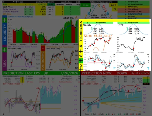
In this section, you will find:
- Weekly and Daily Technical Ratings are shown here. A dedicated video in the Tutorials section explains the Technical Model in detail.
- Inside the Weekly Curve, you will find the stock’s weekly performance over the past three weeks.
- Inside the Daily Curve, you will find the stock’s daily performance over the past three days.
- In the middle charts, the black line represents the weekly price on the left and the daily price on the right.
- In the bottom charts, the thick black line represents momentum, the thin black line represents fast momentum, or velocity, and the blue line represents relative momentum.
- The red dots on the charts mark the days when the company announced earnings.
Chart Location
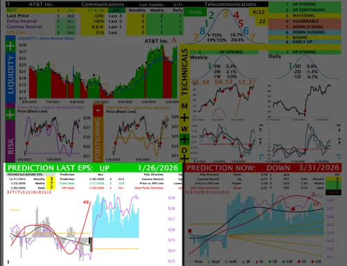
In this section, you will find:
- The bottom-left chart shows the model’s prediction going into the last earnings report.
- The prediction is clearly labeled as either UP or DOWN.
- The Monthly, Weekly, and Daily Technical Ratings leading into the prediction date are displayed at the top left.
- There are three important dates to focus on:Prediction Date and Price – shown at the top, with the prediction date marked by a black bar on the chart. Trade Date and Price – shown at the top, with the trade date marked by a green bar on the chart. EPS Report Date and Price – shown at the top, with the EPS reporting date marked by a red bar on the chart.
- A video in the Tutorials section explains this chart in detail.
Chart Location
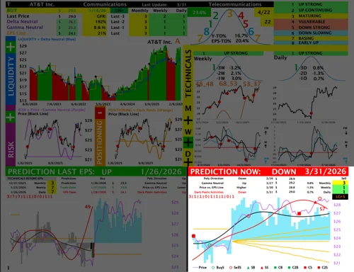
In this section, you will find:
- The bottom-right chart shows the model’s prediction as of now.
- The prediction is clearly labeled as either UP or DOWN.
- The Monthly, Weekly, and Daily Technical Ratings leading into the prediction date are displayed at the top right.
- A video in the Tutorials section explains this chart in detail.